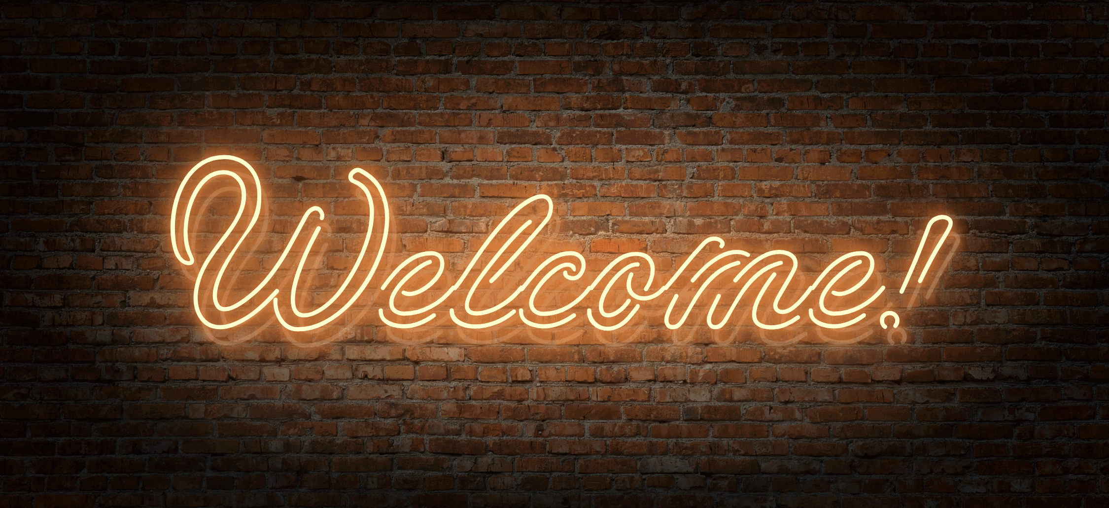
Note: I changed this to an animated gif, as I kept having to update it.
This is the animated welcome banner I originally wanted to display on the home page, but it fails accessibility. It consists of two labels superimposed on each other (negative top margin) with a slight offset (left margin) and a background image (bricks). A CSS animation modifies the label colour and shadow properties, while another CSS animation applies a radial gradient mask on the background image.
I got the base CSS code from Farjana Rashid’s website and Rachel Andrew here, and modified it to suit my needs:
CSS
 /* Neon Text */
 :root{
     --dark: #293138;
     --white: #FFFCCC;
     --glow: #E0823B;
     --pipe: #FAFAFA36;
 }

 .neon-display {
     z-index: 10;
     animation: animate-neon 5s linear infinite;
 }

 .neon-display .guten-background-overlay {
     animation: animate-bg 5s linear infinite;
 }

 .neon-display-shadow {
     animation: animate-shadow 5s linear infinite;
 }

 @keyframes animate-neon {
     0%, 18%, 20%, 50.1%, 60%, 65.1%, 80%, 90.1%, 92% {
         color: var(--pipe);
         text-shadow: none;
     }

     18.1%, 20.1%, 30%, 50%, 60.1%, 65%, 80.1%, 90%, 92.1%, 100% {
         color: var(--white);
         text-shadow: 0 0 10px var(--glow),
             0 0 20px var(--glow),
             0 0 40px var(--glow),
             0 0 80px var(--glow),
             0 0 160px var(--glow),
             0 0 320px var(--glow);
     }
 }

 @keyframes animate-bg {
     0%, 18%, 20%, 50.1%, 60%, 65.1%, 80%, 90.1%, 92% {
         mask-image: radial-gradient(ellipse at 50% 50%, rgba(255,255,255,.1) 0%, rgba(0,0,0,1) 0%);
         -webkit-mask-size: 100% 100%;
     }

     18.1%, 20.1%, 30%, 50%, 60.1%, 65%, 80.1%, 90%, 92.1%, 100% {
      mask-image: radial-gradient(ellipse at 50% 50%, rgba(255,255,255,.1) 0%, rgba(0,0,0,1) 70%);
      -webkit-mask-size: 100% 100%;
     }
 }

 @keyframes animate-shadow {
    0%, 18%, 20%, 50.1%, 60%, 65.1%, 80%, 90.1%, 92% {
        color: var(--dark);
        text-shadow: none;
    }

    18.1%, 20.1%, 30%, 50%, 60.1%, 65%, 80.1%, 90%, 92.1%, 100% {
        color: var(--pipe);
        text-shadow: 0 0 10px var(--glow);
    }
}